Showing posts with label Basic Grey. Show all posts

Friday, April 2, 2010

Layout of the Week - FRIEND chipboard mini album


I'm excited to share this week's Layout of the Week with you!  But first, I want to apologize for missing all sorts of blogging opportunities last week.  It was Spring Break here and we took Jake in to have hernia surgery on Tuesday.  We were expecting to be home that day, but our wise surgeon advised us to stay overnight in the hospital just in case the little guy needed some extra pain meds.  And thank goodness we did, those extra pain meds let him sleep through just a few of the MANY interruptions...I know that the wonderful nurses & residents have to check in on patients all night long, but boy, it sure would be nice if patients could get more sleep in the hospital.  So my schedule was thrown for a loop last week.  But I'm bouncing back this week, just like Jake...baby steps for both of us!  If you're in the Portland area & in need of an excellent Pediatric Surgeon, I highly recommend Dr. David Bliss.  He's done surgery twice now on Jake and he's a great listener, explains everything so even people who aren't medical geniuses (like he is!) can understand and he's saved the lives of countless preemies, infants, toddlers & kids!

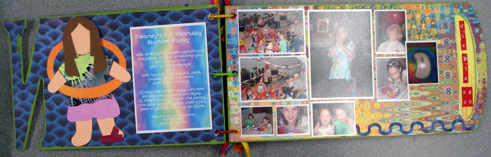
So back to my project!  I created this mini album to celebrate Delaney's 8th birthday.  I did actually get it done a couple months ago, so she did get to see it before her 9th birthday!  I used Bo Bunny's My Word Chipboard FRIEND album and Basic Grey's Lime Rickey collection pack, plus a ton of fun embellishments to create a fun, bright colored album, perfect for Delaney's Tie Dye Slumber Party Photos. (Read all about our Tie Dye Slumber Party activities HERE.)

I used one of my favorite tips to squeeze a ton of photos into this small book.  I created photo collages with Costco's photo organizer program so I could cut them apart and put all different sizes of the tiny photos on my pages.  I love being able to create these collages and use so many photos in such a small format album.

Here are all the fun inside pages!


Of course, since it's Friday, you can join me over at Ann's for her Virtual Girls' Night Out!  I'll be celebrating mine by working the crop tonight at Whimzee's Scrapbook Studio in Beaverton...if you're in the area, call to sign up (we have a couple spots left) or stop by & shop, I'd love to meet you!  Be sure to check out our online community if you're in need of some extra inspiration, we have 300 project photos for you to enjoy!

Tips

Use Costco's photo collages to squeeze a few more photos into your projects!

Don't be afraid to mix it up with bright colors & patterns, it creates a whimsical page!

Use paint to coat the edges of your chipboard albums, it covers up any number of flaws in your (or my) paper cutting skills!

Supplies

Basic Grey Lime Rickey collection pack paper & stickers

Bo Bunny My Word Chipboard Album - FRIEND

So many embellishments...it would take a year to list them all, if you have a few you're wondering about, leave me a comment & I'll get you the manufacturer info.

Thursday, November 5, 2009

Layout of the Week - Children of the Corn


In honor of Halloween, I created this fun layout last week. Our first outing of the Fall was a trip to The Pumpkin Patch on Sauvie's Island, just outside of Portland. If you're in the area, you should definitely add it to your Fall list next year. They've got a great maze, farmer's market, lot's of food booths...elephant ears, corn on the cob, carmel apples, sausage, burgers, loaded baked potatoes...animal barn, gift shop, hayride to the pumpkin patch (or skip it if it's too muddy & pick one from the huge pile next to the market) and of course a HUGE maze. This year's maze was a tribute to the Portland Trail Blazers, check out the photo in my layout.

This layout was my first effort at designing to someone else's sketch. I have all sorts of sketches & sketch books in my inspiration pile, but this is the first one I've done right to the sketch...pretty much, anyway. I created it for a layout call from Ella Publications. It was a lot of fun to try a technique that I've recommended to so many people, but haven't tried myself. I'm near the end of a set of 6 beginning scrapbooking classes where I've designed the layout, then created a sketch and kit for the participants. We'll be starting the classes again in January if you're in the Portland area and in need of some scrapbooking support! They're at the Hillsboro Library and they're FREE! I'll post about them when we've got the dates firmed up.

I was excited to use the Eerie collection from Basic Grey. I'm a big fan of using all sorts of patterns together in my layouts and Basic Grey's collections are some of my favorites. This layout features black vinyl THICKERS from American Crafts, I was excited to be able to create this title from a set I've used for two other layouts. That just shows you that the packs of THICKERS really give you a great selection of letters. My journal box is a tag from 7 Gypsies, I filled in the blanks and then wadded it up and stretched it out again, inking the edges & creases. I inked the outside edge of the layout with black ink to bring everything together. I put my little spin :) on the sketch, by tilting my layout, trimming the edges & mounting it on one last patterned paper...sneaking in another pattern...YEAH! My favorite embellishments on this page are my trusty garden twine (seem to be using it a lot recently) and the little black spiders were in a pack in my Halloween decorations, so they practically "jumped" onto the page as I created it!

I hope you're inspired to design your next layout from a sketch! Check out these cool sites for some great sketches:

52 Sketches ... a new sketch every week

got sketch? ... they've got 92 sketches on their site right now!

Creating Keepsakes Magazine ... all sorts of FREE sketches to download and also lot's of other cool downloads, brushes for you digital scrappers, journal boxes & tons more!

Tips

Give the sketch technique a try. Maybe keep to the original sketch your first time, if you're nervous. Then let your creativity go wild! Rotate the sketch 90 degrees, flip it over for a mirror image on the facing page, set your design askew on another piece of paper (what I did on this one), use journal boxes, embellishments or patterned paper in place of some of the photos...the ideas go on & on!

Use a tag instead of a journal box on one of your layouts.

Check out your gardening supplies, use twine instead of ribbon on your next project.

Supply List

Basic Grey Eerie collection papers

American Crafts THICKERS - Daiquiri black vinyl letters

Thick Twine (not sure of manufacturer)

Mini GlueDots

7 Gypsies Tag

Small plastic spiders (not sure of manufacturer) - found them in my Halloween decorations

Tuesday, October 27, 2009

Layout of the Week - I Love Your SMILE!


I was so excited to see the challenge handed out by the ladies at the Ella Publishing blog. They were looking for layout submissions with the title, "I Love Your Smile." That was the only criteria, just use that title. I think karma brought me to this gleeful photo of Delaney. For the past couple weeks, I've been designing baby layouts for my next beginning scrapbooking class, so I had a pack of photos of Jake when he was first born right there on the table. When I saw this page call, I flipped through the photos to see if any of them fit the title. And boy, this one jumped right out at me. This is THE happiest I have ever seen Delaney in a picture. It was taken, probably by Dave, just after Jake was born. We gave her this great I'm the Big Sister t-shirt and she was so excited, she put it right on. She was over flowing with joy that her little brother, whom she had waited so long for, was finally here! It brings tears to my eyes to look at it, when I think of how happy she was.

Her reaction to the photo, while I was creating this page, cracks me up! She looked at it and asked if it was taken when Jake was born. I said yes and that she was so happy. Being 8 1/2 now and having her brother be almost 2, she said, "I love him, but I don't know if I'm that happy about him now....he did cry a lot and...you know, mom, he's Jake." So that makes this picture that much more special to me, what a beautiful innocent smile, so excited that her baby brother is finally here. Unbeknownst to this sweet little girl are all the things about babies that aren't so fun, the SCREAMING (you have to know Jake to know I'm NOT kidding), the wet & poopy diapers, the hitting, throwing & destroying, etc. Of course she is still the happiest big sister in the world, when her little guy says her name, "Dee Dee, Dee Dee" or when he walks up to her, tilts his head, puckers his lips, closes his eyes, and cranes his neck toward her just hoping for a kiss.

Those are all reasons that this photo makes me a very happy mom! I hope you all create layouts showing something that makes you happy!

As far as the layout, I used the Cricut to cut the circles, placing my matted photo inside the largest circle to draw attention to it. I placed the title around the circle, also in an effort to draw attention to the photo. I chose journal strips for this page because a journal box might draw attention away from my photo. Inside the strips is my jounaling, "a girl was never so happy to have a little brother." I think that all the elements of this page help draw attention to Delaney's photo. I think it's important for her to have some pages in her album commemorating her brother's birth that show her reaction. He will have tons of blue pages showing all the exciting happenings after he was born and big sister needs a little attention too!

Tips

Try mixing chipboard styles when creating your titles. The mix will give your layouts a whimsical look.

If you aren't happy with the color of your chipboard, so ahead & paint it. Here I painted chipboard with both paint and glitter glue.

Don't be afraid to add other embellishments to your chipboard. Here I added ribbon, rhinestones & stickers to my chipboard shapes.

Supply List

Basic Grey June Bug collection papers
Admiral: used the back side
Park Bench: used the back side
Picket Fence: used the back side

Prizm light & medium pink textured cardstock

Pink Metallic Ribbon

KaiserCraft Basics: Rhinestones - light & dark pink and Rhinestone strips - pink

Creative Cafe pink chipboard shapes

Circle shapes all cut with the Cricut

"I" - Tim Holtz Grungeboard harlequin alphas

"your" - American Crafts THICKERS hat box plain chipboard

"SMILE" - Die Cuts with a View foil chipchatter uppercase - pink

Mrs. Grossman's casual alphabet stickers

American Crafts Memory Marker pen - soft black

Paint
Scrapbook Shades by Li'l Davis Designs - marshmallow

Ranger Adirondack Brights Acrylic Paint Dabber - raspberry

Monday, October 5, 2009

Layout of the Week Basic Grey June Bug


The bright colors & bold patterns of June Bug jumped right off the shelf & into my basket. At first, I wasn't sure what type of layout I would design with them, but I knew I had to have them. When I set the papers out on the table in my studio, I moved them around thought about their patterns. After some thought I decided that these great bold patterns deserved a bold layout.

I chose Cabana, the navy paper with the white plaid design as my background. Next I wanted to use some of the large flowers from the Fresco print. I decided to use the flowers in two corners of the paper. And instead of cutting a strip or square from this paper, I chose to trim around the flowers and leaves, to help them stand out from the background.

With all of the patterns in this layout, I wanted to include a nice solid that would help divert some of the attention to the photos and away from the design of the page. The June Bug collection didn't have the paper I was looking for, so I decided on Lime Cooler from the Lemonade collection. I used Lime Cooler as journaling strips and the first mat behind my photos. Photo mats are typically created in the shape of the photo set on them. I kept with this idea for the second mats behind my photos, although I mounted these mats and twisted them a bit. Then I veered away from the idea of a traditional photo mat when I included the circles behind my first two layers of photo mats. I liked the idea of using the circle pattern of the Chicken Pox paper, cut into a circle as my non-traditional spin on a photo mat.

When I finished this layout, I was happy with how it turned out. But I really thought it was still missing something. Normally, at this point, I would wander around the store or dig through the stash in my studio to find the perfect embellishment to finish a layout. This time I felt that the strong graphic colors, pattern and design could easily stand on their own. And I really liked the idea of creating a great layout on a budget (5 sheets of paper), without the addition of pricier designer brads, rub ons or stickers. I had used the thin end of my Zig Writer to journal on the strips and realized that its thick end would create the perfect final embellishment for my page. I used the Zig Writer's thick end to draw an edge around my trimmed flowers and non traditional photo mats. After creating this edge, I was very excited with my final product.

This was a fun layout to create and lead to a long list of tips that will help others create similar layouts! I can't wait to use my idea of outlining a layout with a pen on another project soon!

Oh, and I forgot to mention the story shown in the layout. These photos are from Delaney's very first gymnastics performance. She was nervous, but very excited to perform with her team before our local professional soccer team's game this summer. I only have these two photos because I was video taping the performance with my camera. It was important for me to create a memorable layout for this memorable occasion.

Tips

If you're nervous about mixing patterns on one layout, try using patterns gathered from one collection.

Remember to include at least one solid in the mix to use as a mat for your photos. You want people to pay attention to both your design and your photos.

When adding a bold pattern to your layout, use just a portion, trimming around the items you want to include.

Use small strips of your solid as journal strips. This is especially helpful when you want to include a little journaling, but don't have a "book" to write for the page.

Add some non traditional shapes to your mats for an original look.

Save money, by using a thick black pen to outline portions of the graphic papers in your layout. You can choose which items to draw attention to, and let others fall into the background.

Supply List

Basic Grey, June Bug collection
Cabana
Chicken Pox
Fresco
Tea Party

Basic Grey, Lemonade collection
Lime Cooler

Zig Writer pen, black

Monday, October 27, 2008

Basic Grey Ambrosia Pumpkin Patch Layout

After seeing my pumpkin patch pictures, I was really excited to create a layout for them. First, I thought about using some of Reminisce's sparkly Halloween paper. But when I put the pictures on it, I just wasn't inspired. Then I caught a glimpse of our new Basic Grey Ambrosia. I thought the oranges in my pictures just cried out for the variety of oranges showcased in the Ambrosia papers. I printed my photos in 5 x 7 and wallet size at Costco and used 8 different Ambrosia papers on this page. I cut simple rectangles and arranged them around my pictures. Then I used the Cricut at the store to cut the swirl design from one of the papers. And to finish off my page, I used black vinyl Thickers letters.
Now I've got to get to work on the other half of this double-page spread. I'll use the same background paper, Clementine, and I have about 8 more wallets that I plan to put on the page. For my layouts, I like to get everything together and then take some time to mull over all my ideas. This is probably why my projects take a while to materialize, but I enjoy the design process so much, I'm not bothered by it at all. I know that once I finish the layout, it will be something I love. I'll be sure to post the other half as soon as the inspiration for the design comes to me! :)


Wednesday, July 23, 2008

Just one more thing....Basic Grey Euphoria

Oh, and today when I was finishing the Whimzee's newsletter, I came across all these cool layouts in the Basic Grey Gallery. They use the Euphoria collection which recently arrived in the store. But what I really like about looking at layouts is that I can "scrap-lift" them to use with my photos & other papers. I do love Euphoria, especially the "Cool" paper, it looks like the designs I used to make as a kid with my spirograph! Basic Grey really does have some of the best paper designs out there, so check it out!

http://www.basicgrey.com/catalog/idea_gallery.php?cPath=88

LinkWithin

Related Posts Plugin for WordPress, Blogger...