Showing posts with label Reminisce. Show all posts

Wednesday, January 20, 2010

Layout of the Week - BELIEVE Bo Bunny My Word Chipboard Album

Sorry about not posting a Layout of the Week last week.  Between regular duties, jury duty & a sick kid, time just flew by.  But I do have a special project this week.  I want to share the album I created to commemorate Jake's 1st Christmas.  I love the Bo Bunny My Word Chipboard Albums and BELIEVE is my favorite one.  These albums are great to display on your coffee table or mantle where people can grab them & quickly flip through them.  When I created this one, I wanted to use bright colors and traditional red & green to create a fun album the kids would love.  I chose Reminisce's Snow Globe collection as my paper & stickers for this project.

If you're interested in how to create your own My Word Chipboard Album, click the links below for step by step instructions and photos.  I created this class last Fall for the scrapbook store blog I write.  You could also use these techniques for other types of chipboard albums.

Julie's Bo Bunny Chipboard Album Classes

Class #1 - Gathering the Supplies
Class #2 - Choosing & Adhering the Paper
Class #3 - Trimming the Paper
Class #4 - Painting the Edges
Class #5 - Ribbon, Ribbon & More Ribbon

This last weekend, I started a new Bo Bunny My Word Chipboard album.  I chose FRIEND to create a birthday party album for Delaney with photos from her 8th birthday party.  She had a tie dye slumber party, so I was looking for very bright patterned papers.  I chose Limerickey from Basic Grey and it's perfect.  I'm ready to paint the edges, so I'm about 1/2 way done.  I'll be sure to share it with you once it's all ready to go!

But for now, here's my BELIEVE album for you to enjoy!  Remember, January is the perfect time to put together an album with all your memories from last Christmas...while you still remember them! :)


For all you VGNO partiers...

Would you rather have Bob or Jillian as your trainer?

(I've been working out with a group of mom's at school this week, to the Biggest Loser DVD's, and I'm strongly a BOB person!  Can't deal with people yelling at me while I'm attempting to work my as off!)

Thursday, October 22, 2009

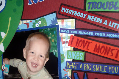
Layout of the Week - Our Little Monster


When I first saw the new Monster collection from Reminisce, I just knew I had to use it for a new Jake page. I had just taken some funny photos of him. Our own little monster turns into a tornado every day. The little tornado moves quickly across the living room to the hearth, where we store his toys, grabs things and starts dumping, tossing, throwing them across the room. He plays & plays in the middle of this mess. We reorganize & straighten up his stuff about five times everyday. All the little cars in their container, books stacked nicely, balls in the toy box, etc. And then he wakes up! And it's back to tornado mode! So one day, I decided to take photos of all the little messes he made that day, all over the room. Of course when I looked at the photos, the room didn't really look as messy as I thought it did. But still, picking up the same toys so many times everyday, I guess it just adds up!


I used my new favorite embellishment on these pages! I outline the edges of paper, stickers & photos with the thick end of my black Zig Writer. I love how the black helps make things on my pages stand out.


The pages have so much going on with all the color & pattern of the paper and stickers. And then there is also the size of the stickers to take into consideration. I wanted to add a little more embellishment, so I added a ribbon to the tag sticker on this page. It gives a little more dimension to the page, while not competing with all my other elements.


That day, as I was photographing his disaster, he just stood, leaning against the couch, smirking at me, as if to say, "Look how cute I am! There's no way you can be made at me about this!"

But wait...could he be turning over a new leaf? As I'm writing this, he just brought me the Swiffer Sweeper, out of the coat closet & had me turn it on so he could vacuum...we'll see...

Tips

After you finish a layout, add a thick black outline to some of your page elements to help them stand out from a busy background. I use the thick end of a black Zig Writer.

Try adding a thin solid color ribbon to your page, for a little extra dimension that won't take away from your page design.

Don't be afraid to cover up portions of your photos with large scale stickers.

Use a few smaller photos or wallets (as I've done here) grouped together. They give the feeling of one large photo, while telling more of the story than one photo would.

Supply List

Reminisce Monsters collection papers and 3 different sheets of Monsters self adhesive stickers: words, tags & journal boxes & large monsters

Thin Grosgrain ribbon, navy & orange

Zig Writer, black

Wednesday, October 14, 2009

Layout of the Week - Fall Leaves


These pages commemorate one of Delaney's favorite Fall activities, jumping in the leaf piles. Every year, Dave heads out to blow & rake the leaves in our backyard. He piles them up & puts them into the yard debris bin so they can be hauled away and turned into mulch. And it never fails, Delaney runs out into the yard, yelling for him to wait to put them in the bin until she gets a chance to run & jump into the piles. Of course being a mom who is always thinking of the laundry & stains that will be created by her kids' adventures, I remind her to run upstairs & put on some old clothes so I won't have to spend hours getting the wet leaf & dirt stains out. Then I grab my camera & head outside with her. I sit behind the leaf pile shooting tons of photos, so that I'll be sure to get some great action shots.

For the layout, I had a couple things to take into consideration. First, I was given sample sheets of the Shades of Autumn collection from Reminisce to create a sample for the store and I wanted to use as many of the patterns in my layout as I could manage. Next, I wanted to include as many photos as I could and still have the layout look balanced. Since this was one of my first forays into using many mixed patterns on a layout, I chose a neutral background for them. And then chose to use strips of the patterned papers so everyone could see how they worked together. Strips of paper are one of my favorite simple layout techniques. You can adhere them in a jumble manner, like I did here or place them in horizontal or vertical stripes or perpendicular to each other in the corner of your layout. I placed mine in a jumbled way to echo the way leaves fall into piles with colors and shapes all jumbled together.

With so much going on in my layout, I chose to mat my photos in a mix of neutral fall colors pulled from the patterned Reminisce papers. I used stickers from the Shades of Autumn collection on both pages. For a some extra texture, I added ribbons from American Crafts. And for one last embellishment, I placed four square bronze brads on the floral ribbon on the right page and one under the column of stickers on the left page.

For me, this is a fun layout, with a lot going on! And that's just how I feel about Fall, so many fun things going on to enjoy & photograph! So grab that rain jacket & scarf (some of you probably need ski jackets & snow boots too...) and don't forget your camera!

Tips

When shooting photos of the kids jumping in the leaves, try sitting down & stabilizing your camera by leaning your arm on something steady, like a tree, rock or even just your leg. If your camera has a setting for action, use it, if not, just use your auto setting. Next, focus the camera on the pile of leaves & send the kids running toward you, pressing the shutter when they reach the leaves. Try this a few times and you should end up with some fun photos.

If you're new at mixing patterns on your layouts, choose a few patterns from one collection and find a neutral that is common among the patterns and use it as your background.

Using strips of the patterns on your layout allows you to showcase a few patterns without having them overwhelm the photos on your page.

For an added embellishment, place brads on your ribbons.

Supply List

Shades of Autumn paper collection from Reminisce
dark brown cardstock from Prizm
ribbons from American Crafts
bronze square brads from unknown source

Thursday, August 27, 2009

Layout of the Week - Gymnastics


Delaney has been a gymnast since she was two. These pages commemorate her 2007-2008 year. Her individual & group photos are included along with coach & friend photos.

I was excited to find gymnastics paper that matched her Mini Olympic leotard for that year. Reminisce's Gymnastics papers in Perfect 10 and Gymnastics were fun to work with. I designed my layout to fit in as many of the "I Love Gymnastics" sayings as I could.

When I set my photos on the blue textured paper, I realized they would look find without mats. Not using mats made this a quick, easy layout.

First, I created the left page. Then I measured everything and created a mirror image layout for the right side.

This is a quick, simple, economical layout, using just two textured cardstock sheets, 2 printed sheets and one set of epoxy stickers as embellishment. For approximately $6, you can create a beautiful double-page spread, with some gymnastics papers leftover for more pages.

Tips

When using a solid background paper coordinates well with the subject matter of your photos, try laying them out on the paper to see what they look like. If they stand out nicely, consider not matting them. I love matting, but it does take extra time and it increases the cost of your project. So consider going without every once in a while!

Try creating the left side of a layout and then using its mirror image on the right side. This works best when you have photos that are the same size or photos that you can crop to the same size.

Use printed paper as an embellishment. I embellished my page with, not only the epoxy stickers, but with pieces of the gymnastics designed papers.

Supply List

Textured Royal Blue Cardstock (2 sheets)

Reminisce Gymnastics Collection Papers - Perfect 10 and Gymnastics

Creative Imaginations Epoxy Gymnastics Stickers from the Sportz Collection by Danelle Johnson

Tuesday, July 7, 2009

Layout of the Week - Tooth Fairy


This week's Layout of the Week is a special page for Delaney. She lost her first tooth on April 5th, a few weeks after she turned 8 years old. Yes, her first visit from the tooth fairy didn't come until she was 8 years old! After MUCH effort I managed to pull the darn thing out for her. She had been wiggling it for about 2 years.... By the time she was finally ready for it to come out, she wanted us to tie it to a door & slam it, which we did...about 5 times! Both her new front teeth were in by this time and she had what her dentist called "shark teeth". Two rows of bottom front teeth. After taking a look at this tooth, the dentist's mouth dropped open (out of Delaney's view of course) and he said, "you got this out?" The root on the poor tooth was longer than the tooth itself. After the tooth finally came out and Delaney had her $2 from the tooth fairy, she made us pay up too. We had promised her $25 if she could get the tooth out before the dentist wanted to pull it. We decided that it would be cheaper to bribe her with $25 than pay the dentist for an extraction. It worked with that tooth, but the dentist told her that she has until August to get that other lower front tooth out or he's going to pull it. After all the drama, screaming & crying & door slamming, I don't think she figures $25 is worth pulling the next one out herself. So I guess we'll have to wait & see, but she does have an extra little "center" tooth on the bottom as of this post!

As far as my layout is concerned, this is one of my more simple ones and I'm very happy with it. I used two sheets of Reminisce's Tooth Fairy paper, one side for the background and then a strip of the other side as a mat for my photo, edging it with the Redwood ink from last week's project. Next I used two small strips of the white glitter paper from last week's layout on either side of the strip. It's so nice when the supplies & papers you just used on a layout are right there on the table just waiting to be used again. Then I used a red pen to journal inside the title that is printed on this paper. This layout couldn't be simpler, in fact it took about 10 minutes from start to finish. The one photo tells the whole story, I tried to take a picture of the strangely shaped tooth, but it came out fuzzy. And besides, all of the ladies scrapping that night thought it would be gross to include a photo of the tooth in a layout. But I probably would have done it anyway, if it had been in focus.

Try the technique of using one large strip of paper with two smaller ones framing it in one of your layouts. It's a very quick way to finish a page!

Wish us luck with that next Tooth Fairy visit!

Tuesday, June 30, 2009

Layout of the Week - Happy 4th of July


I thought I'd try something festive for this week's Layout of the Week. So in the spirit of the 4th of July, I created a layout with my photos from last 4th of July. I love using large photos in my layouts, so I printed my photo of the kids all decked out for the neighborhood parade as a 5 x 7. I cropped the photo to a 5 x 5 square for the page, since the extra was just my garage in the background. For such a sparkly holiday, I used as much "blingy" scrapbook product as I could.


I love all the diecut paper in the stores now, but couldn't find anything for my 4th of July layout. So I started with Reminisce's Sparkly Stars paper and then thought that it would look great on a bright red background. Next I chose a diecut paper with the bracket shape. I traced the bracket shape onto a thin piece of cardboard and then cut along the lines and created my own stencil for the bracket shape. I traced half of this shape onto the Reminisce paper & cut it out to create a custom diecut for my page. Then I flipped the stencil over and traced half again, so I'd have a piece for each side of my page with the stars facing up.

I mounted my photos on red textured & white shimmery papers from American Crafts. I inked the edges of most of my mats to add a little something extra. Next I cut my titles with the Quickutz die cut system using two sizes (classic & mini) of their Eliza font. I used iridescent metallic paper for the letters. For the final touches on this layout a used a mixture of red, clear & blue rhinestones in star and circle shapes, along with some metallic ribbons.

Here's a list of supplies used on this page:

Red Textured papers from Prizm & American Crafts
Reminisce Silver Stars paper
White shimmery paper from American Crafts
Iridescent Metallic White paper
Dew Drop Brilliance Platinum Planet ink
Ancient Page Redwood & Cobalt ink
Metallic Twill Ribbon in Red, White & Blue
Felt Flowers
Kaisercraft Red & Blue Rhinestones
Queen & Co. Red, White & Blue Star Jewels
Quickutz Eliza Font in Classic & Mini

If you're looking for inspiration check out Sunday Scrappin'!

Tuesday, June 9, 2009

Layout of the Week - Graduation Shadow Box


My niece Emily graduated from High School last weekend. Although it makes me feel old, I couldn't be more proud of her. When I started considering what type of gift I wanted to give her, I thought it should be something full of memories. I wanted to make her something unique, that would remind her of this special time.

I love shadow boxes, so I decided to create one for Emily. I started out with a plan. I knew I wanted to use her school colors and that I wanted to use a 12" x12" size frame. I chose 12" x 12", so that she could take the paper out of the frame someday and put it in a photo album.

I hoped to find a white shadow box, but could only find a black one. I decided to paint it white, and Dave was nice enough to sand it for me. Then I used some leftover white primer and semi gloss paint from Home Depot. It's so nice when things you've been saving forever finally come in handy! After one coat of primer and two coats of paint, I coated the frame with clear Glitter Glaze from Li'l Davis Designs. All girls just need a little more glitter in their lives! :)

For the inside of the box, I wanted to use Emily's school colors, so I checked with her mom and found out the colors are royal blue and white. I chose a shimmery foiled paper, Hat Toss from the Graduation Collection by Reminsce, for my background. I used the Cricut die cut machine to cut my letters and tags and their shadows out of white Bazzill Bling and royal blue metallic papers. To adhere the letters and tags, I used my Xyron Create a Sticker 250.

I used two double mats, one vertical and one horizontal. It will be easy for Emily to choose two 4” x 6” photos to place on each mat.

I placed a mix of pearls, rhinestones and ribbons on the background to give my creation a little flair. I’ll make a list of supplies at the end of this post.

When I was making the tags with Emily’s name, I made a few trying to get it just right. Since there were extras, I used them on the gift and card. It will be fun for Emily to use these on her dorm room bulletin board.

So if you’re looking for the perfect graduation gift, give a shadow box a try! It’s an easy way to create something your loved one will cherish.

Supply List
12” x 12” MCS Scrapbook Shadow Box Frame
Li’l Davis Designs clear Glitter Glaze
Reminisce Graduation Collection, Hat Toss Foil Paper
Metallic Paper – Royal Blue Paper
Bazzill Bling – White Paper
KaiserCraft White Pearls & Royal Rhinestones
Misc. Ribbons in Royal & White
Royal Felt Flowers
Royal Glitter Brads

Monday, April 13, 2009

Layout of the Week - Delaney @ 8


OK, I'm a little late getting this posted...should have done it last week. You know how life goes, lot's of stain removing, grocery shopping, blah, blah, blah. So maybe I'll be really industrious & get two in this week, not promising anything though!

With all the Jake layouts I've been doing lately, I wanted to make a special one for Delaney. All the photos were printed at Costco. We had the photos taken at Sears & I bought the CD so I could print my own photos. I used Costco's photo organizer program to create the collage. You really should check out this program, it allows you to gather your photos and then drag them into place on a collage template. They offer quite a few templates, this is my first experiment with their collages. After dragging your photo into place, you can zoom and then move it around in the space for just the right cropping. You can also flip your photo, so it's going the right direction. DO be sure to check that your photos are all facing the direction you want them to, before you print them or send them to Costco. On Jake's collage, I forgot to turn one of the photos before I sent it to Costco for printing. Then I didn't even notice it wasn't facing the right way, someone from Dave's office pointed it out to him! When I went back into the program to flip it, I wasn't able to figure out how to do it. I think I have to drag & crop all my photos into a new template & print it again. Just a tip, in case you get a little carried away or distracted, like I do, when you're creating something new!

For the layout, I printed the collage as an 8 x 10 and the left side photo as an 8 x 8. The background paper is a zebra pattern called Dress Code from American Crafts' Teen Collection. The pink is a Prism Metallic named Desire. The white is a texture that I thought resembled a zebra pattern from World Win. I love the zebra ribbon from Creative Impressions. And if you're looking for the letter stickers, they come on a 12 x 12 sheet from Reminisce. The little ribbons on the left side, are a collection of different black & white ribbons from the shelves at Whimzee's.

I love how the zebra paper looks with Delaney's black & zebra top from Gymboree. When I took a look at this finished layout, I knew I had to make one for Delaney's friend. Her room has just been painted....zebra on the bottom half and bright pink on the top. I haven't seen it yet, but I know that this paper combo will look perfect in a shadowbox in her room.

If the photo you'd like to use with this paper combo doesn't quite match...maybe the clothing isn't black & white or the background is busy, just have your photo printed in black & white. I love how you can change your photos on Costco's site, even after you upload them. You can try them in other color combos too...blue & white, pink & white, green & white and more. If you don't have a Costco near you, they can mail you your photos. 4 x 6 prints are only 13 cents and my favorite 8 x 8's are $1.49.

I'll try to get this week's layout finished & posted this week. That's the goal anyway. I hope you enjoy this layout. Let me know what types of information would be helpful to you and I'll try to incorporate them in my future Layout of the Week posts.

LinkWithin

Related Posts Plugin for WordPress, Blogger...